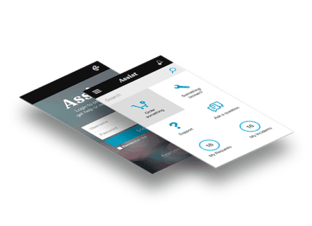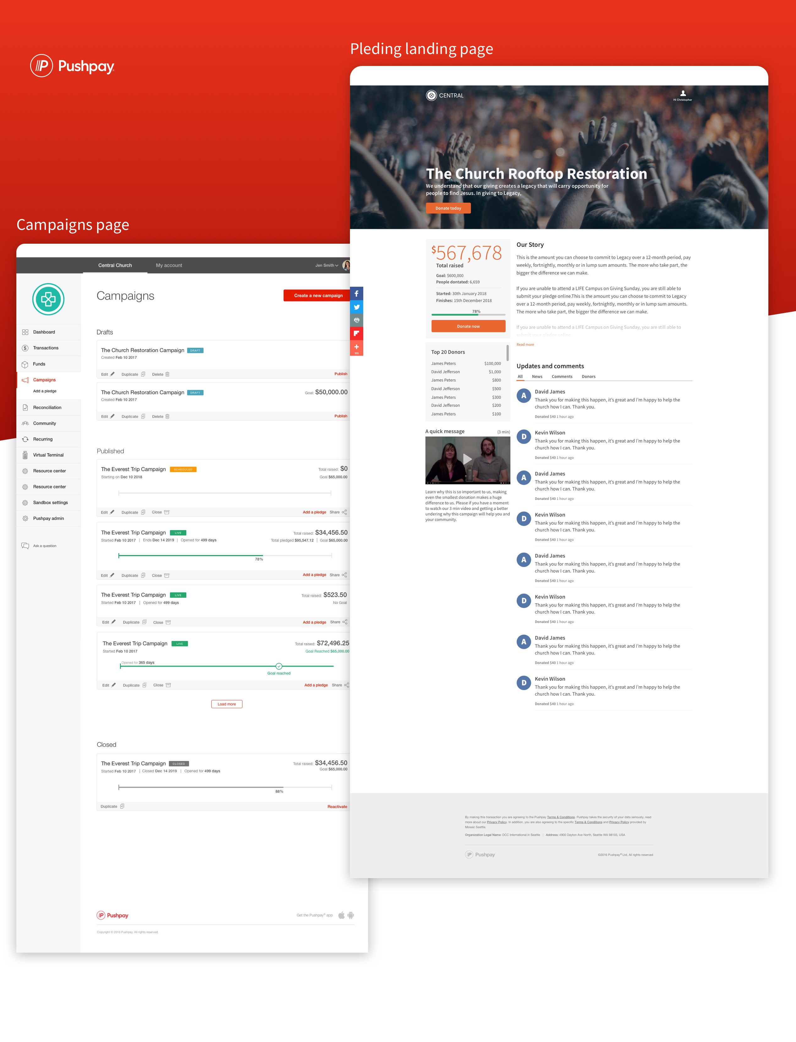

Pushpay Campaigns and Pledging
Purpose and problem
Church wants to be able to see the overall financial status of a pledge campaign in a visual manner that is suitable for sharing with and motivating church members as well as for internal use.
Process
From inception, we followed a collaborative process, working closely with Developers (FE and BE), Project managers, and UX Researchers, having regular catch-ups with product designers, and challenging the status quo of what our customers wanted and what my designs displayed.
Starting at the beginning, we workshopped the problem. What are we trying to solve? Why, and the bigger question, should we? Stepping into research, I was allocated an exceptional UX Researcher with whom I worked closely with user testing prototypes, tree testing and card sorting.
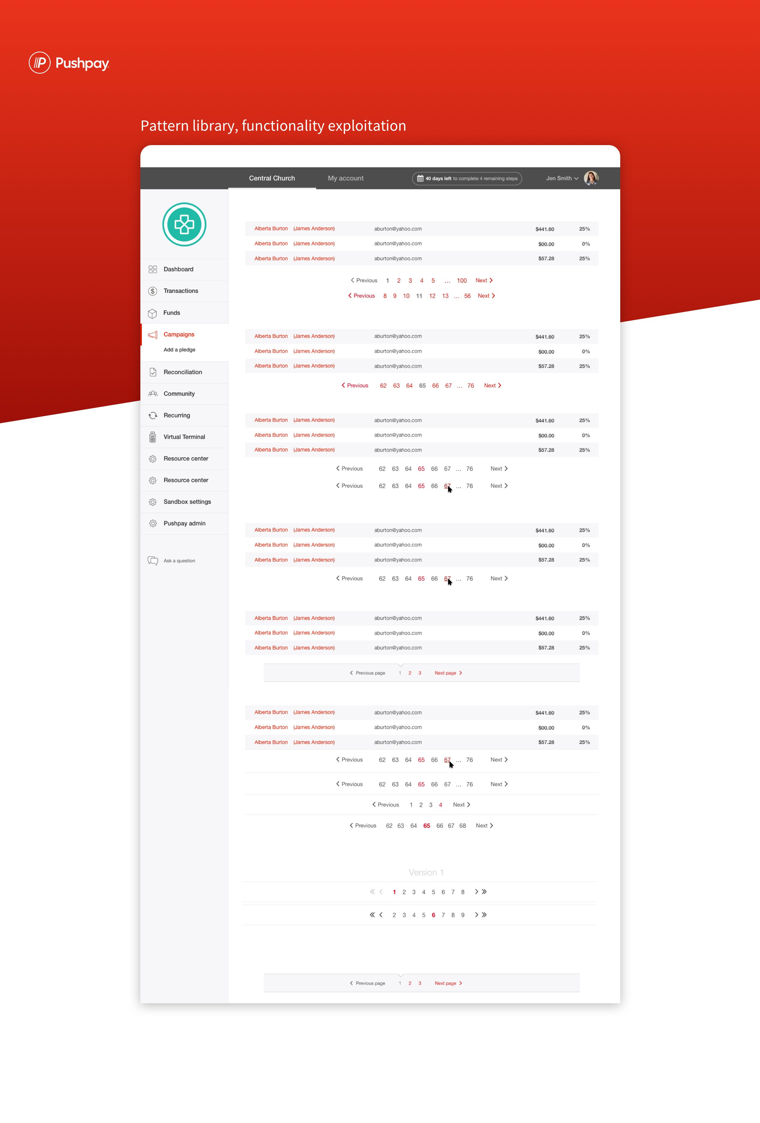
Sketching the LF wireframes, I stepped into user flows and user stories, finishing with high-fidelity designs in Sketch. Micro animations we completed in Flinto or Xd. Roadmapping this project, it was vital to bring along the developer lead to break down the versioning and code patterns pattern libraries to keep consistency.
After we’d locked in our North Star design, we’d break the build into sections or versions, as we came to call them. Strategically this was driven by the Project Manager while I advise from a UX perspective.
We’ve used a number of products
- https://www.optimalworkshop.com
- https://moqups.com/
- https://validately.com/
- https://www.flinto.com/
- https://www.adobe.com/nz/products/xd.html
- https://www.sketch.com/
- Date: 11/01/2018
- Categories: Mobile Design, Product Design, UX, UX Research
- Client: Pushpay
- URL: https://pushpay.com/