NEON Onboarding
I led Product design for the ‘NEON‘ onboarding experience.
My design contributions span a range of platforms, from iOS, Android, and Responsive Web to the big screen, showcasing my adaptability and versatility.
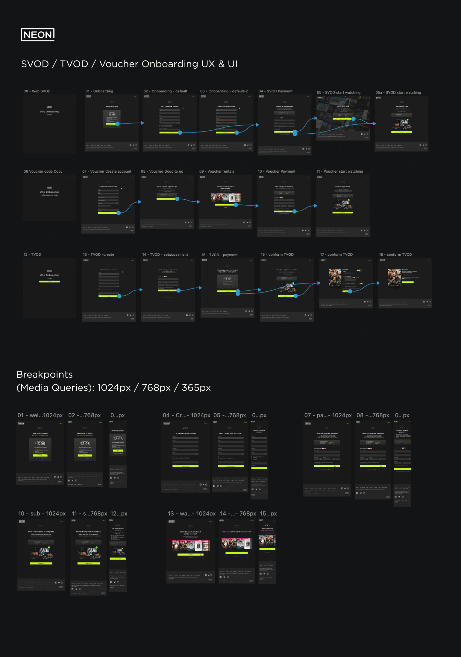
NEON is a Subscription video-on-demand service. The NEON to Lightbox Merger was a large task for Accedo, the merger would include rebranding Lightbox’s core interface, Rentals’ transactional video-on-demand UX, and voucher code UX to match marketing campaigns.
What is Onboarding?
Onboarding is crucial in the user experience journey. It demands thorough comprehension as it plays a vital role in shaping the initial interaction with a product. Statistics reveal that, on average, 77% of daily active users drop off within the initial three days following installation because of bad UX.
- First Impressions Matter: The onboarding process sets the tone for users’ experience with the product.
- Increasing User Adoption: A well-designed onboarding experience familiarises users with the product’s value proposition and demonstrates its benefits.
- Minimising Churn: Products often experience a high churn rate, with users abandoning them shortly after initial use.
- Gathering User Data and Feedback: Onboarding provides an opportunity to collect valuable user data. Understanding how users interact with the product during onboarding helps identify areas for improvement and optimisation.
The brief came in three parts.
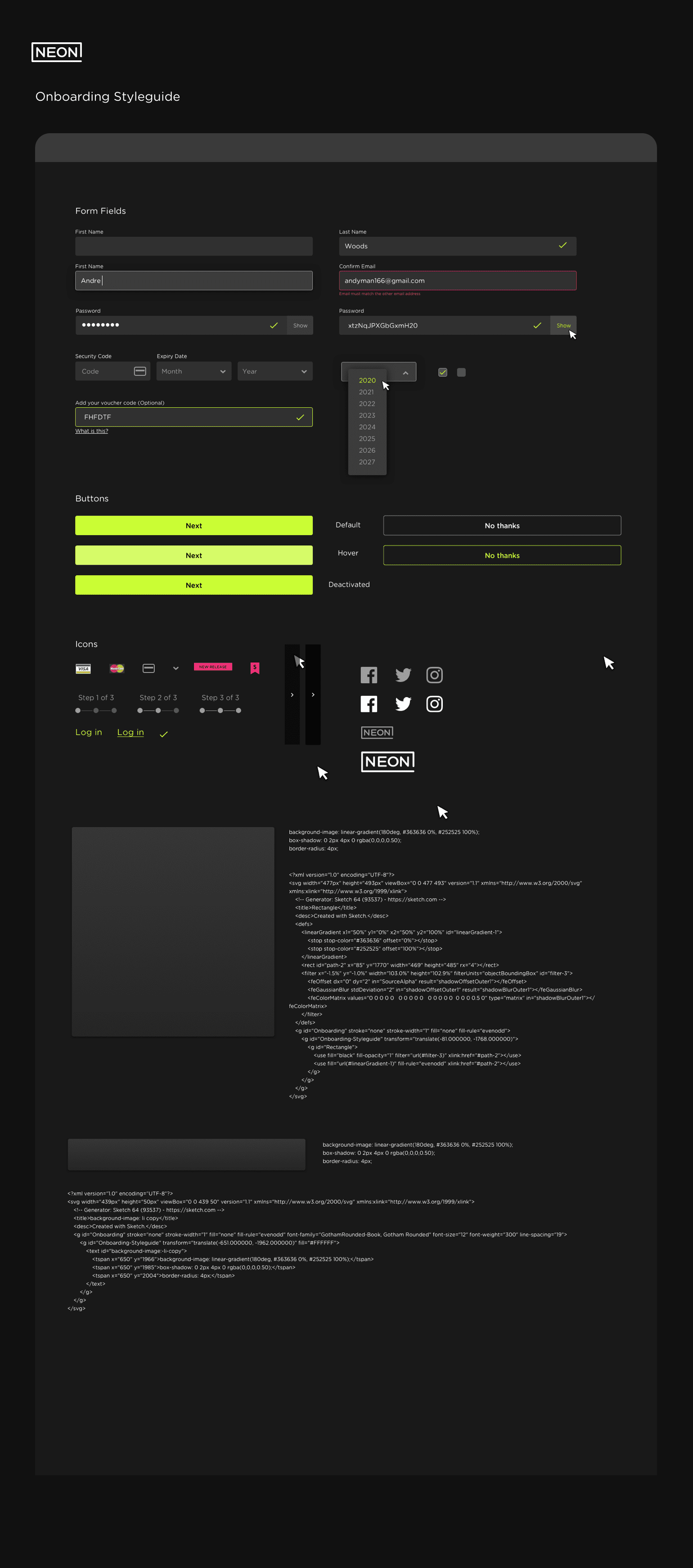
- Update the Design system (Style guide and Pattern library) from Lightbox to Neon.
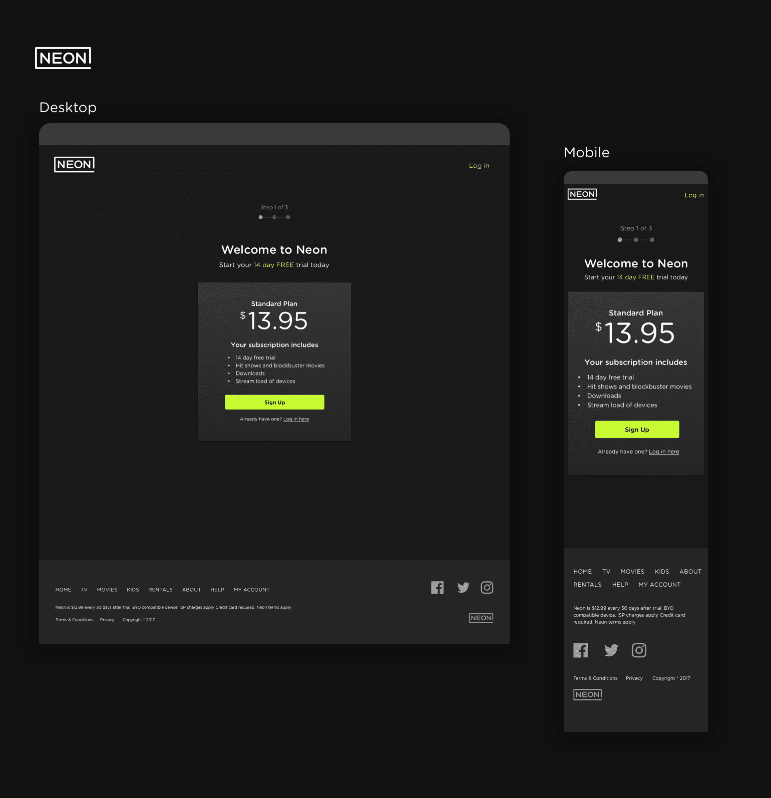
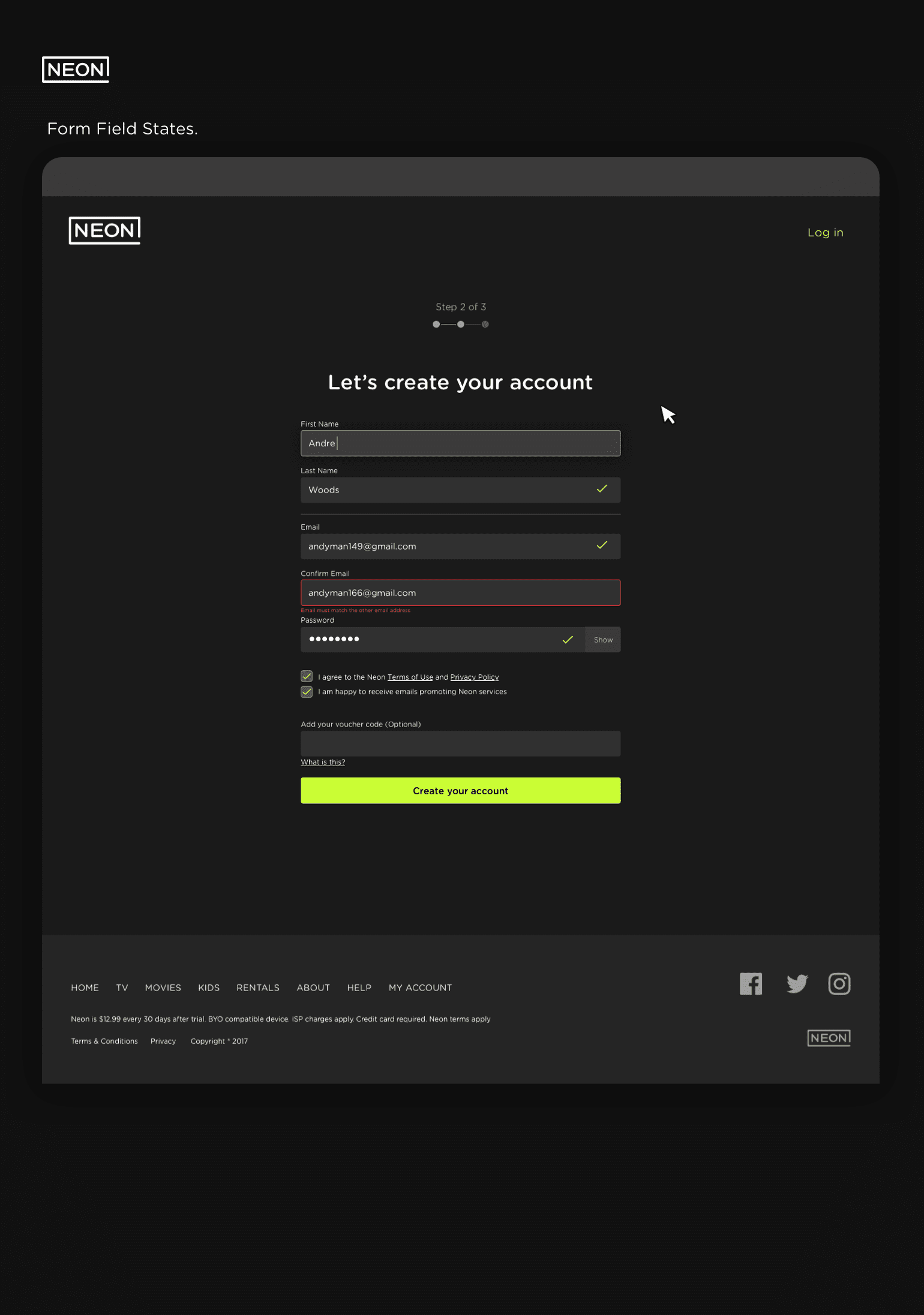
- Create the “Onboarding UX” for new and recurring users.
- Several other briefs were created as we periodically worked, such as Applying the Rentals (TVOD) to iOS and Android devices.
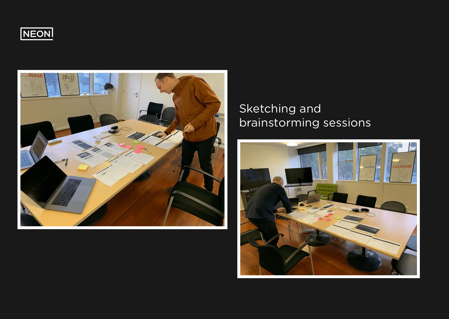
Employing an lean and design sprint UX methods to enhance to NEON version 2.0. The onboarding experience involved qualitative and quantitative techniques. These included competitive analysis, generative research, understanding terminologies, behaviours, mental models, and rapid prototyping to high fidelity UI and IxD design. We designed 70% of the UX so we could approach the product merge rapidly, building, testing to refine the UX while continually incorporating user feedback alongside analytical data. We operated in real-time as a collaborative team consisting of developers, quality assurance testers, and project managers.
Conclusion
- NEON was launched according to the planned schedule, with the entire design, build, and testing process taking three months to complete.
- NEON ranks as the third largest TVOD platform in New Zealand.
- Accedo remains at the forefront of pioneering TVOD experiences, incorporating AR, AI, and VR advancements.
- I take pride in being a team member who successfully executed this project; it was a testament to our collective effort and collaboration.
- Date: 07/01/2020
- Categories: Mobile Design, Product Design, UX, UX Research
- Client: NEON
- URL: https://www.neontv.co.nz/
