LM+ Onboarding and App Store
Problem:
The LM+ App didn’t offer content that resonated with or interested LM customers. It needed to be aligned with their fitness interests and goals.
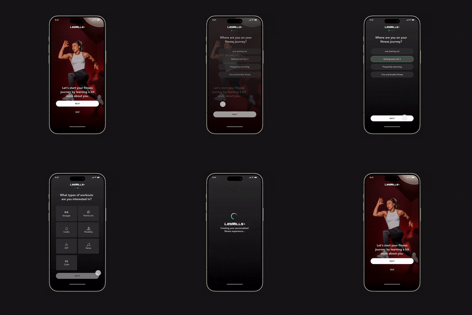
Our objective was to develop and execute a personalised onboarding experience. This approach will enable us to deliver relevant content, features, and recommendations to create a smooth user transition to the homepage by offering them the necessary workouts and information for success.
Goals: Came in two parts.
- Create a new, engaging, and personalised onboarding (Survey) user experience for the user to increase conversion
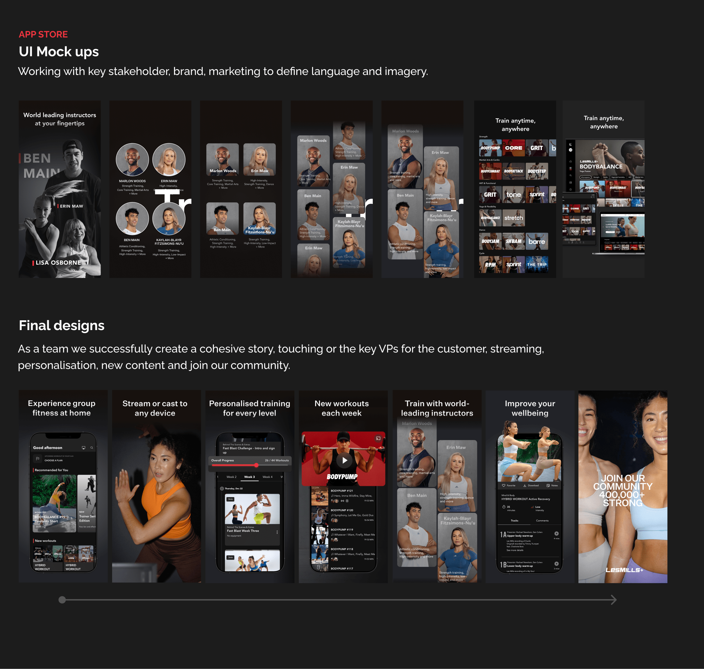
- Redesign the App Store’s stills with a cohesive story, language and images.
Onboarding Research
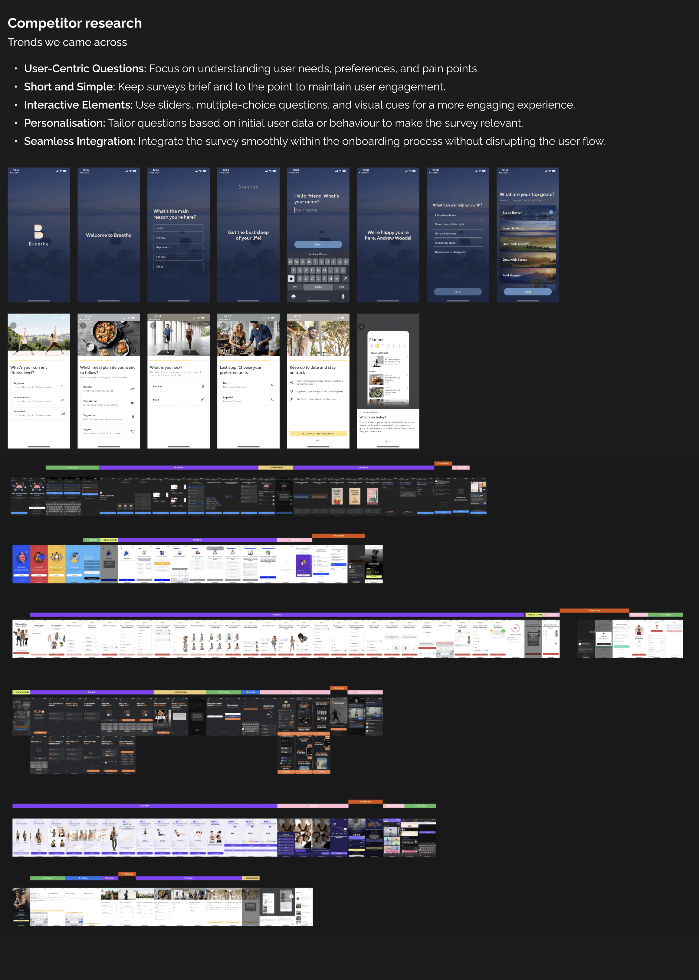
Using a human-centred design approach, we gathered customer feedback through UX research methodologies, including interviews and surveys, to determine what they value. This helped us create a UI app survey that presents relevant content on the homepage, aligning with their needs. By asking the right questions, we aimed to build empathy and trust, making customers feel understood.
Cross-functional teams
I worked cross-functionally with the marketing, growth, and engagement teams, leading the UX strategy to define the value of a seamless customer experience. We removed the initial onboarding UX, as data showed customers were not engaged. We aligned the growth and engagement efforts to work more cohesively with the payment UX and the newly designed onboarding survey experience. Our collaboration with various teams was guided by the RACI model.
App store experience
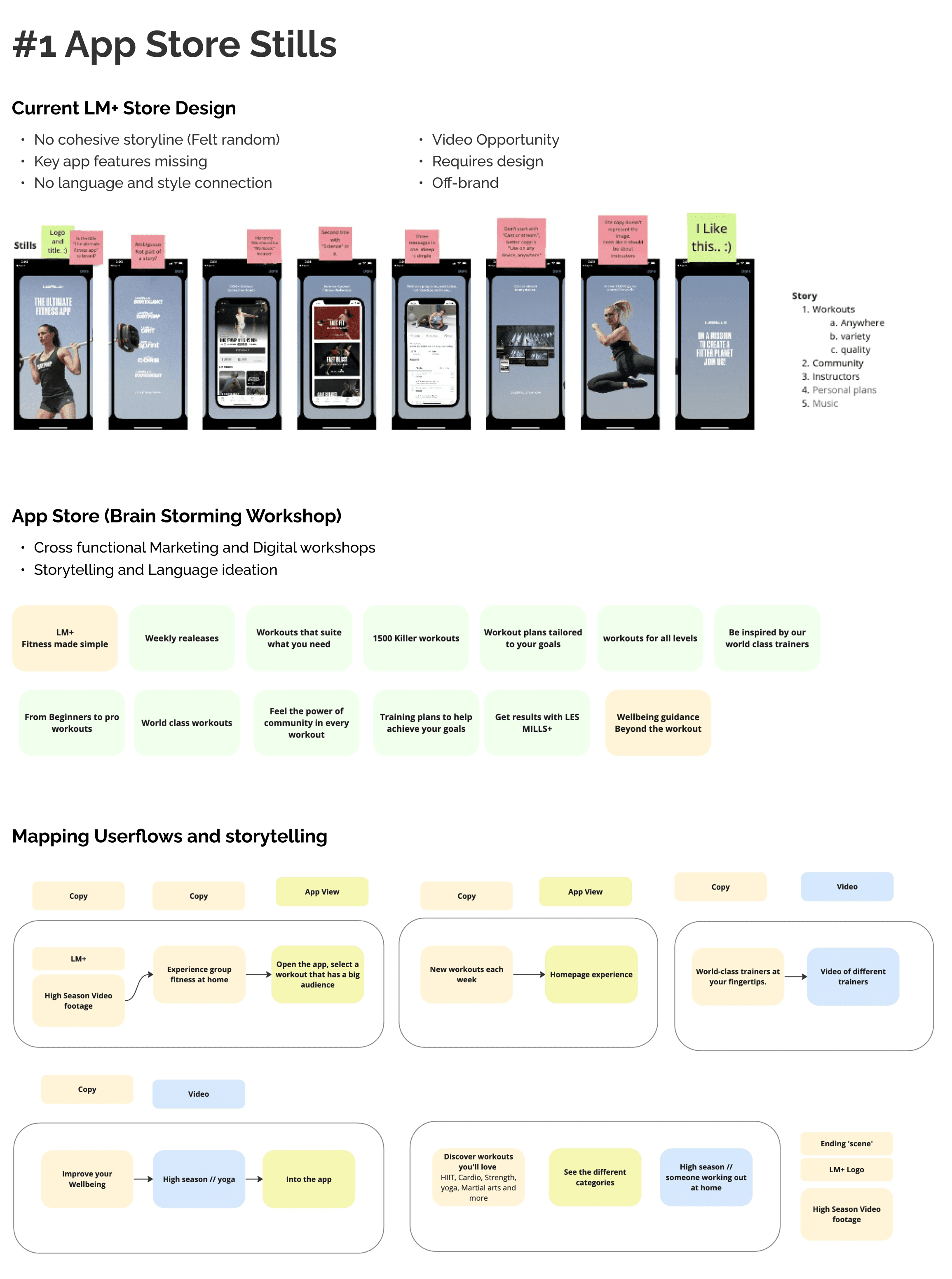
With digital marketing, I lead workshops to ideated user flows, language and stills to support the entire storytelling experience for the customer. What, when and why to drive value for the product. Through final design and images, I aligned to LM+ style guide, to keep consistency.
Onboarding personalisation survey
We had six weeks to complete the work. Our success came down to working cohesively and collaboratively as a team.
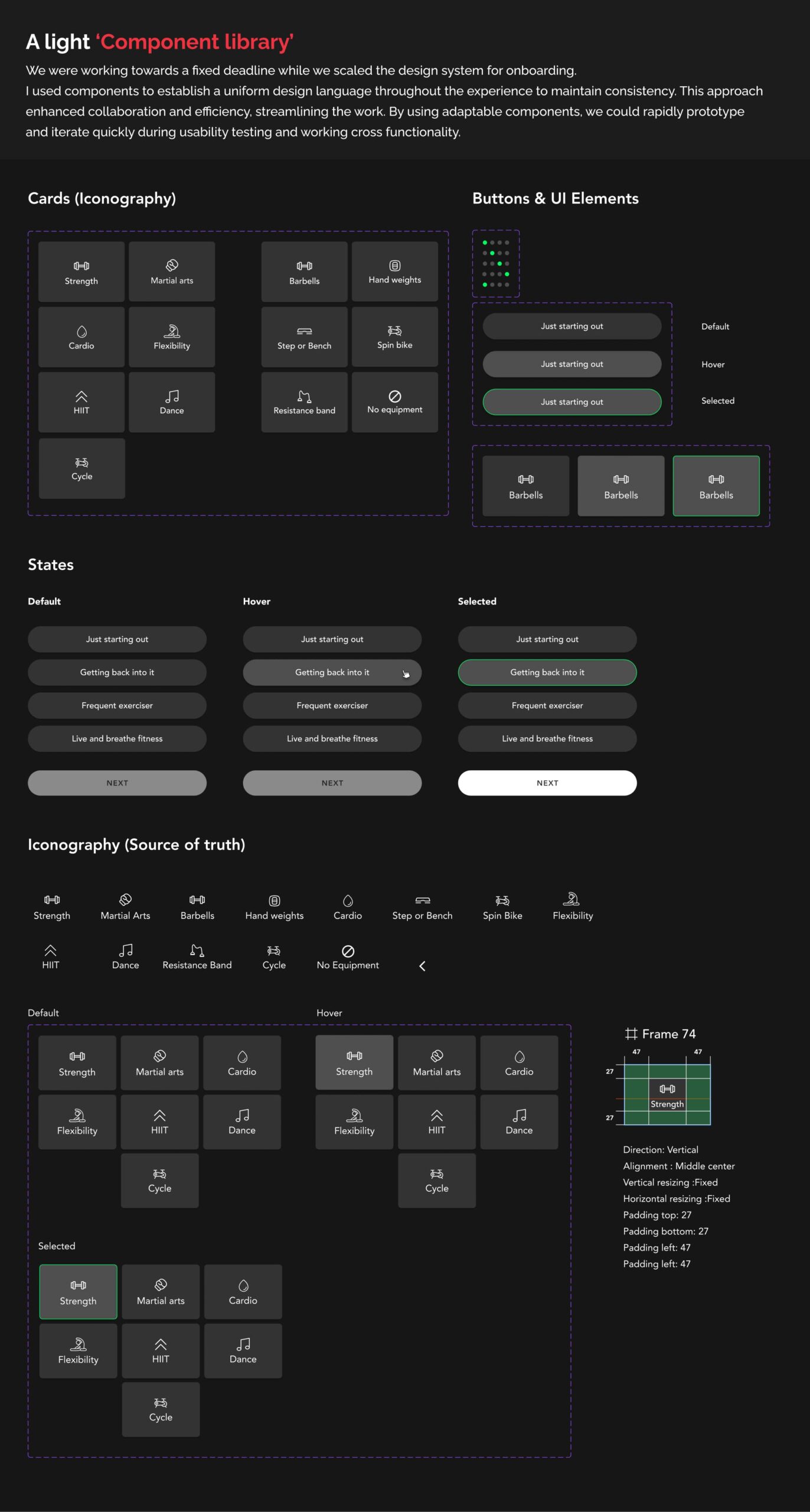
Our team’s efficiency was evident in the way we conducted usability testing with ‘Maze.co’ on Les Mills customers and rapid prototype testing. We swiftly and accurately identified the key friction points using the 80/20 rule and UI best practices, demonstrating our ability to work efficiently.
As we built the feature with the developers, we skillfully navigated the design system’s scaling, recognizing the boundaries and trade-offs for Version 1.0. We were adaptable, understanding that certain questions had to be deferred for later iterations.
We collaborated cross-functionally with engineering, marketing, leadership teams, QA, the design chapter, and stakeholders for regular consultation.
Results:
- Increased conversion rates
- Decreased drop-off rates for the complete onboarding // sign-up experience
- Improved App Store ratings and customer reviews
- Date: 12/09/2023
- Categories: Interaction and Motion, Mobile Design, Product Design, UX, UX Research
- Client: LES MILLS INTERNATIONAL
- URL: https://try.lesmillsondemand.com/

