ecoPortal Mobile App
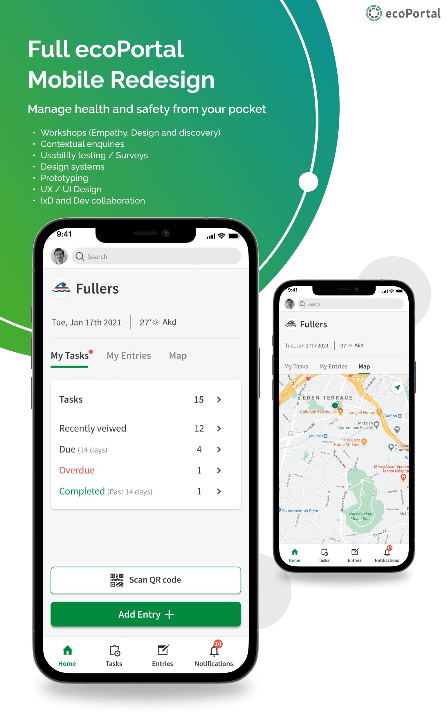
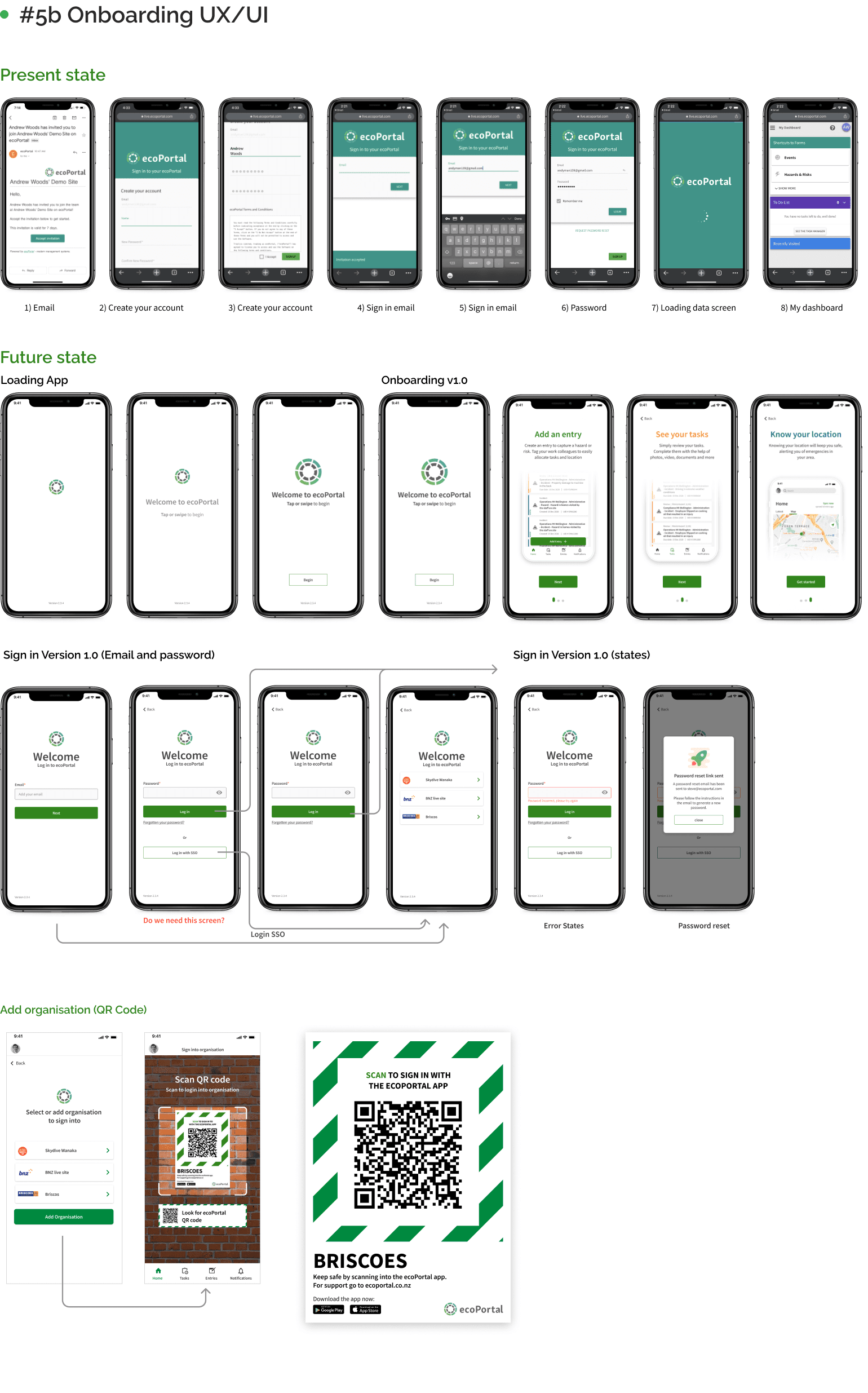
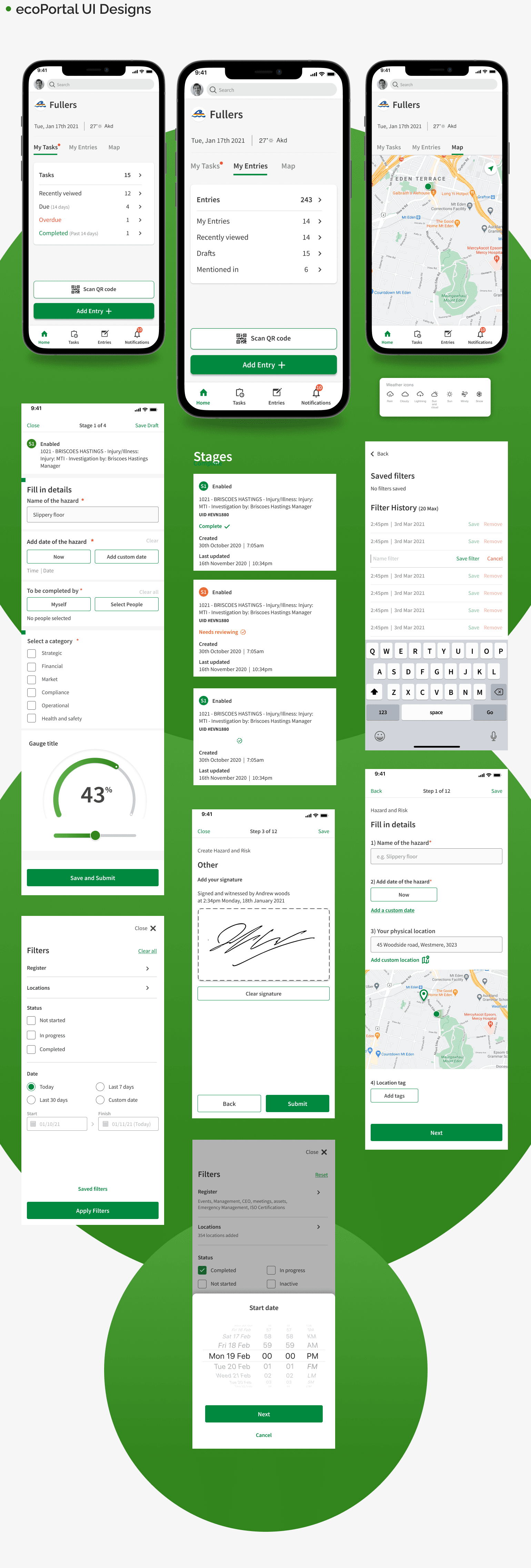
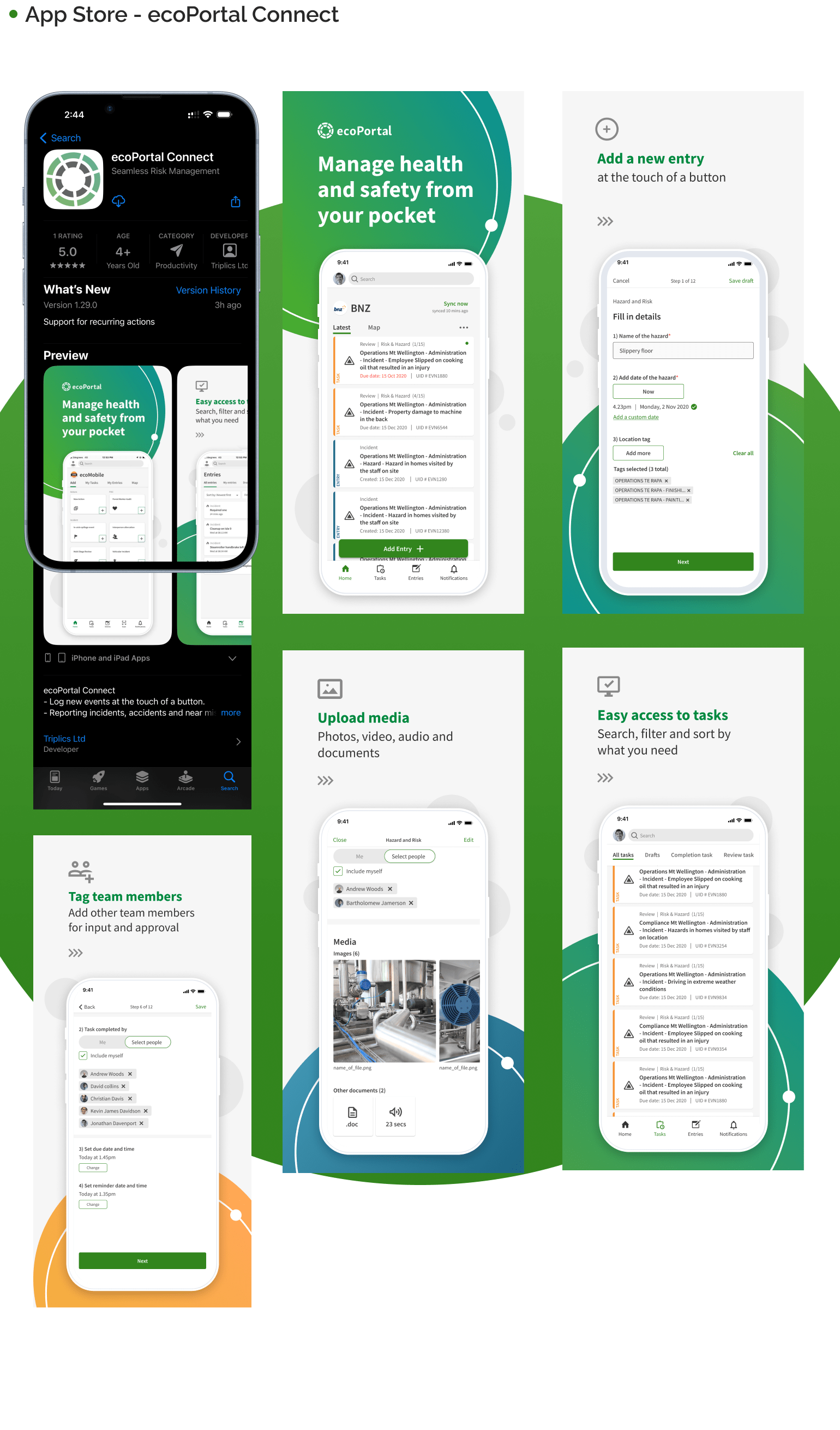
Brief: Full end-to-end redesign of the ecoPortal iOS Mobile app
Business objective: Enhance the overall user experience and increase growth and engagement to improve conversion rates, positively impacting revenue and customer retention.
Problem:
Users were not using the mobile App.
Mobile experiences were dated, complex, and broken with inconsistencies, creating multiple friction points and resulting in a lack of engagement.
The ecoPortal Mobile iOS app copied the web interface, creating complexity. We needed to redesign the mobile app to make it more user-friendly, streamline tasks, and support team collaboration. This presents a chance to simplify the UX to meet users’ needs better.
Process:
Our approach to the redesign involved the formation of a dedicated mobile team consisting of project management, user experience, and engineering. We adopted a two-week sprint and an agile approach, focusing strategically on delivering value. I worked autonomously splitting my time:
- Quick wins (UI Refresh)
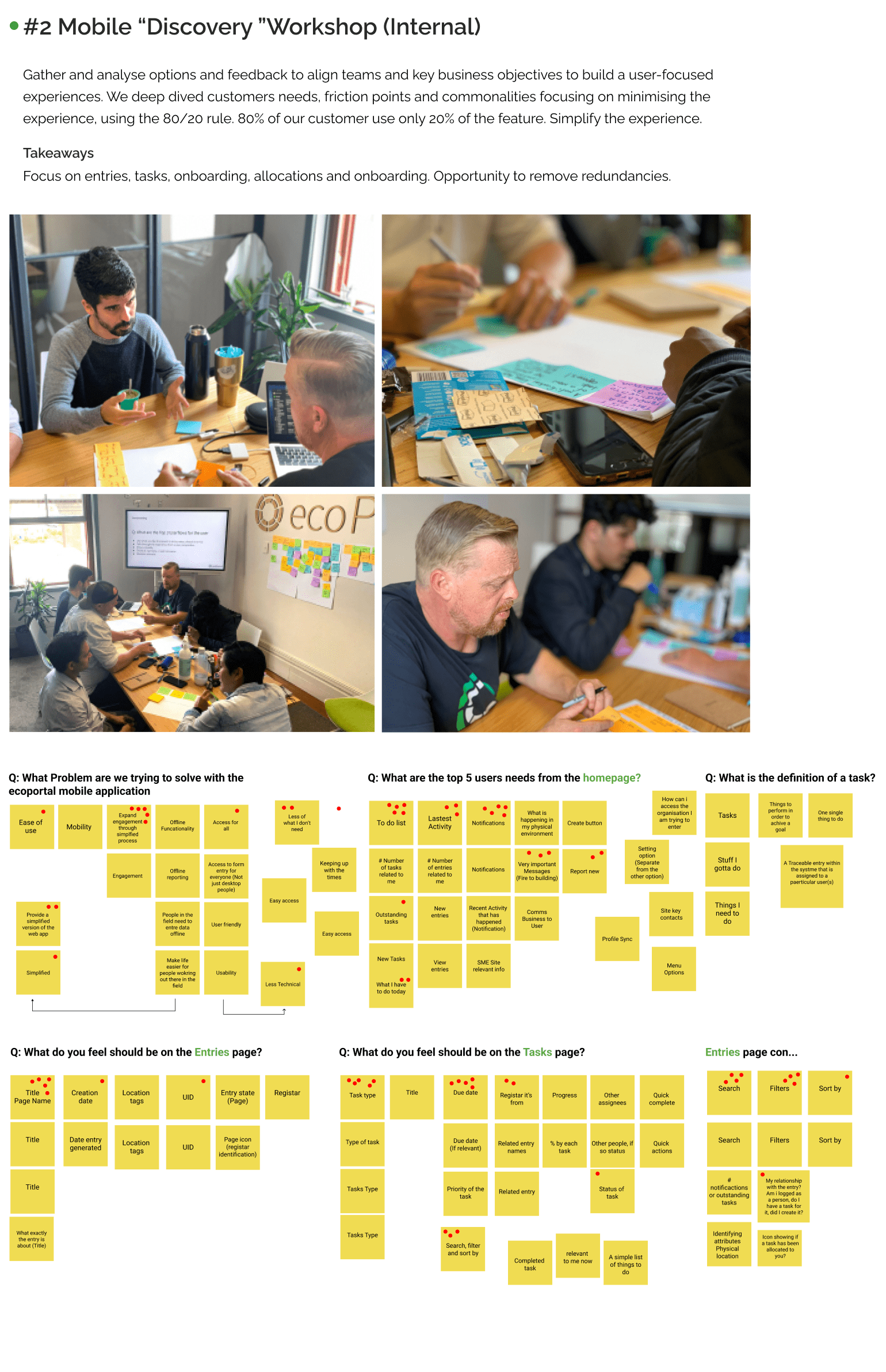
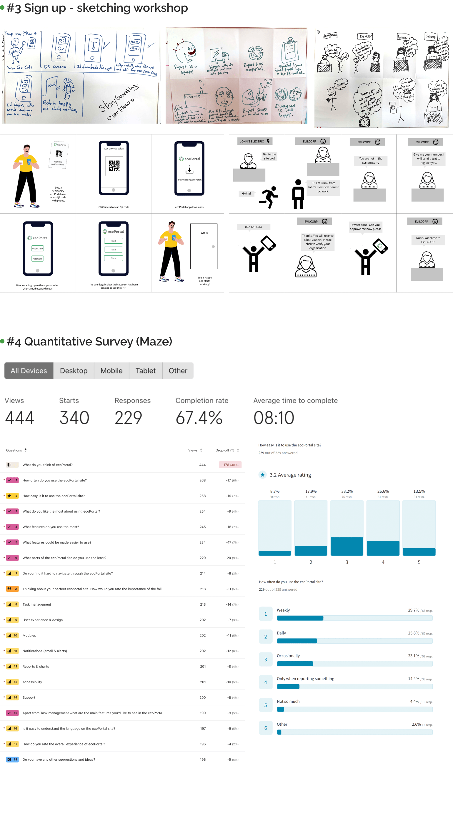
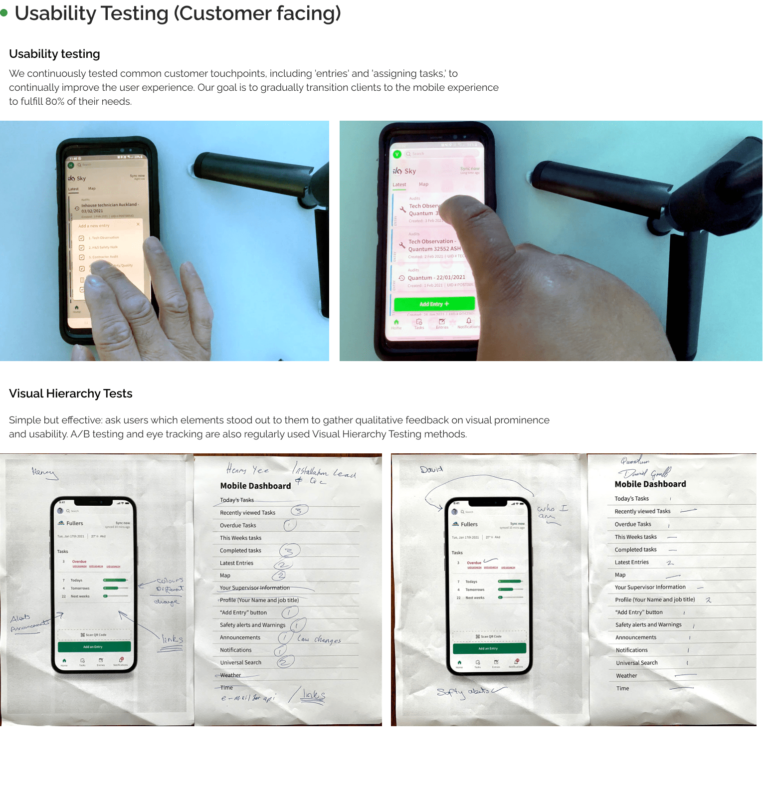
- Qualitative and quantitative customer research
- Design systems.
- UX/UI design (IxD), working across multiple teams throughout the organisation.
- I matured my self-awareness, emotional intelligence, goals and problems to prioritise.
- I held myself accountable for defining and leading UX excellence across the organisation.
Results:
We created a simple UX with a modern interface that simplified the core experiences that 80% of users needed.
We expanded our reach in our market by submitting our UX strategies to deliver enhanced value for the customer. This resulted in a rise in our user engagement from desktop to mobile. Fostering user habits that streamlined their time. We established iterative workflows to facilitate continuous improvement, ensuring a responsive and evolving approach to our services.
- Date: 12/02/2020
- Categories: Interaction and Motion, Mobile Design, Product Design, UX, UX Research
- Client: ecoPortal
- URL: https://www.ecoportal.com/

